Visualizing data
In this article, Tom shares how we use data visualization to simplify taking data-driven decisions. Learn why tables often fail to communicate insights, and how tools like spider charts and multi-gauge graphs make performance data actionable.

Hi there, Tom here! In my last article, I went over our latest project, and how it is changing the way athletes train in mogul skiing. Here it is if you missed it!

In today's article, I'd like to discuss how we approach these kinds of problems, and the solutions we found to deal with them.
The initial data
Here is a quick recap of the data we are dealing with:
After each mogul skiing race, the results are handed out in a PDF file that is particularly hard to read. Coaches and athletes then have to copy out all these numbers one by one into Excel spreadsheets, in order to analyze them, and figure out how to improve before the next race. This is a long, painful, and error-prone process. Here is an example of the PDF files:
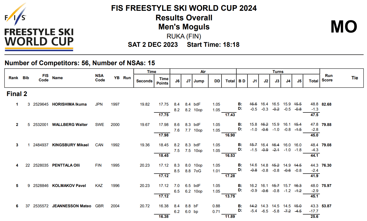
Tabular data is everywhere nowadays. You probably use some on a day-to-day basis. I think we can all agree that staring at tables all day isn't that pleasant, so why is it so popular?
- The first reason is that it is the simplest way to store data (without getting into too much detail, most modern databases work that way)
- The second is that tools like Excel and Google Sheets have made viewing and editing this data accessible to almost everyone. For example, imagine you are dealing with this data table, and you need to know top-rated recipes that take 30 minutes or less to make:

- With Excel: add a filter to the cooking time, and sort by rating
- In SQL (database language): SELECT Name, Type, CookingTime, Rating FROM Recipes WHERE CookingTime <= 30 ORDER BY Rating DESC;
I think it's quite obvious which one is the most mainstream.
Making it visual
Despite being a great way to store and edit data, tables are terrible at displaying it. This is because they can easily overwhelm the user with information, and fail to filter out the essential aspects. The solution, is to visualize data with graphs, though it isn't as simple as you might think. Charts come in all sorts of shapes, and aren't always useful to display the chosen metric.
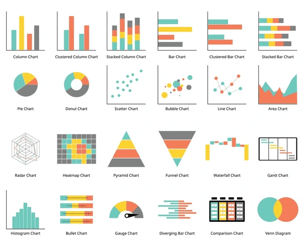
The process of finding the correct charts took quite some time, and we were helped by Adame and Julian, two engineering students from ENSIMAG, in the making of the following study (in french): opendata/2024-2025/abdelaad-couxju-jeannest/
Here are some of the different situations we came across.
Visualizing a difference
The tabular way to display differences is to create new columns with cells equal to the difference between the cells of two other columns.
Here is a better way to display such information:
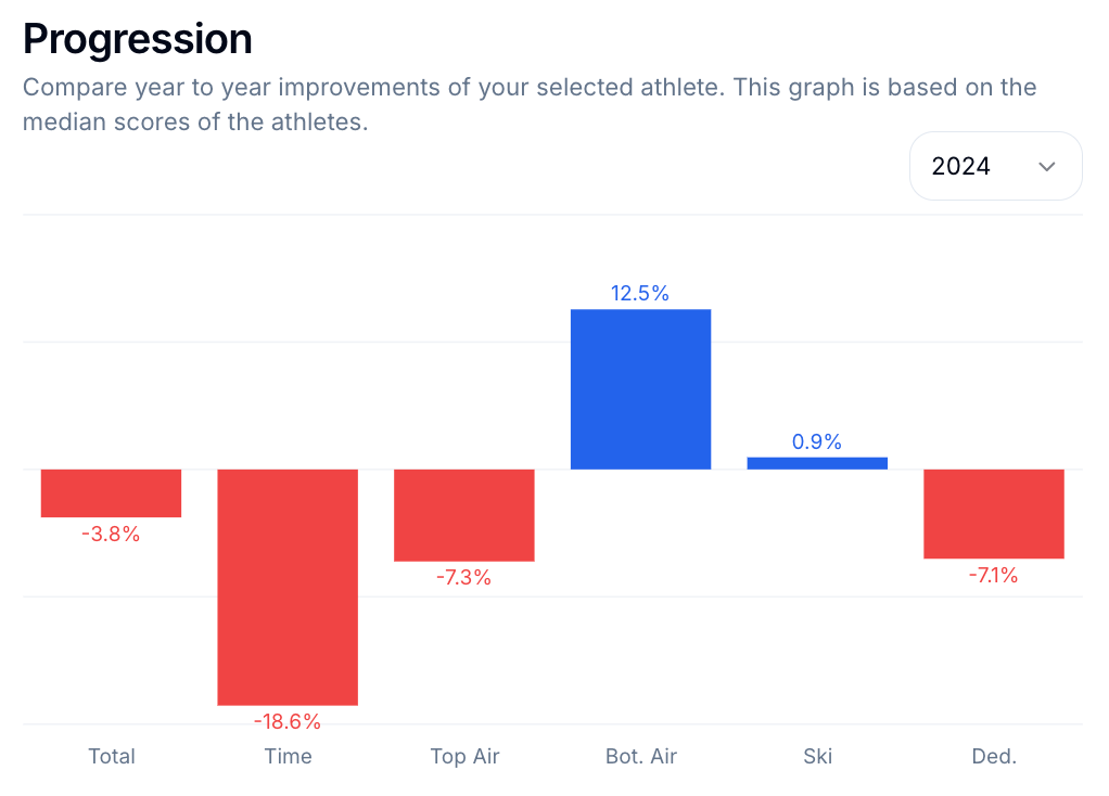
The key takeaways are:
- Using color to show sentiment (good / bad)
- Using size, combined with numbers to show amount
- Keeping the labels (column names) close to the data
Comparing shares
Sometimes, you face a situation where you'd like to compare two different discrete metrics (composed of categories), that use different units. Doing so with tables isn't possible, as this is a three-dimensional problem, and tables only have two. The default way is to use two pie charts side by side, though there is a better way to do so:
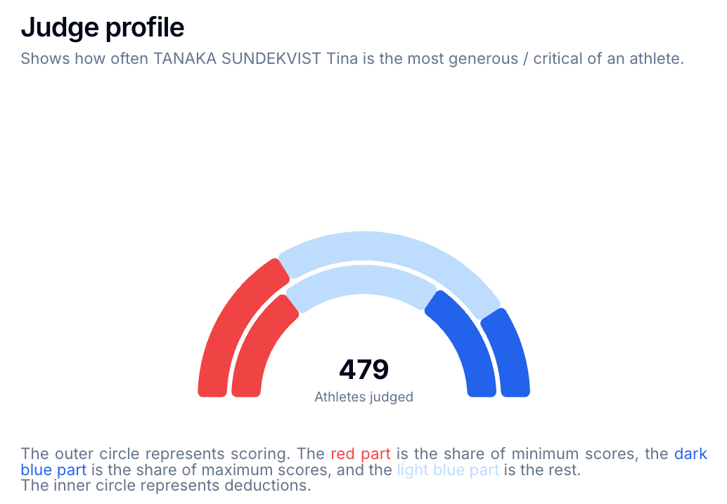
A multi-gauge chart is the perfect solution.
- Colors show the categories
- Angles represent amounts
- You even have room for extra data under the gauge
- The tooltip gives extra context when the graph is hovered
Comparing different scales
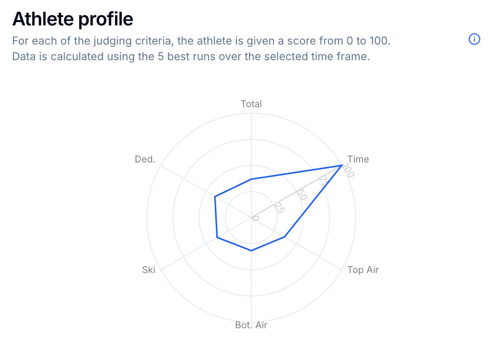
Within our dataset, we have different scoring criteria, that have varied ranges. The ski grade is around 45, the jumps are around 8 each, and the speed is near 15. If you were to represent the athlete's profile with a bar chart, it would visually look like they are way better at skiing, as the scores are naturally higher. This is an extremely common issue, that can lead to bias and misinterpretation.
The way to alleviate this is to scale the data, bringing all the values to a range between 0 and 100 for example. This can be done by applying the following function to all values (min and max are the smallest and largest values of each category):
f(x) = (x - min) / (max - min) * 100To visualize the data, we can now take advantage of a spider chart, and immediately see the athlete's strong suites (the selected athlete is very fast):
Conclusion
This article was a demonstration of how data visualization can solve common day-to-day problems. Though it isn't always as simple as it might seem, knowing a few tricks can often go a long way when it comes to taking data driven decisions.


