Twister Spread: bringing data science to mogul skiing
Discover “Twister Spread,” our latest project, transforming how mogul skiing coaches analyze race results! Tom being a former mogul skier turned engineer, we are tackling the time-consuming process of manually extracting data from PDFs.

Hi there, Tom here! This week's article will be going over our latest project, Twister Spread. As some of you might know, I competed in mogul skiing up until last season, where I chose to focus 100% percent of my time on my engineering career. However, my passion for this sport didn't end there, and I'm now so happy to be working as a computer scientist, to help out fellow athletes!
What is mogul skiing?
Mogul skiing (ski de bosses in French) is a freestyle skiing discipline where athletes navigate a steep, bumpy slope (moguls) while performing quick, precise turns and aerial tricks on two jumps (one at the top of the run, and another at the bottom). Scoring combines technique (60%), aerial execution (20%), and speed (20%). Here is a video for reference:
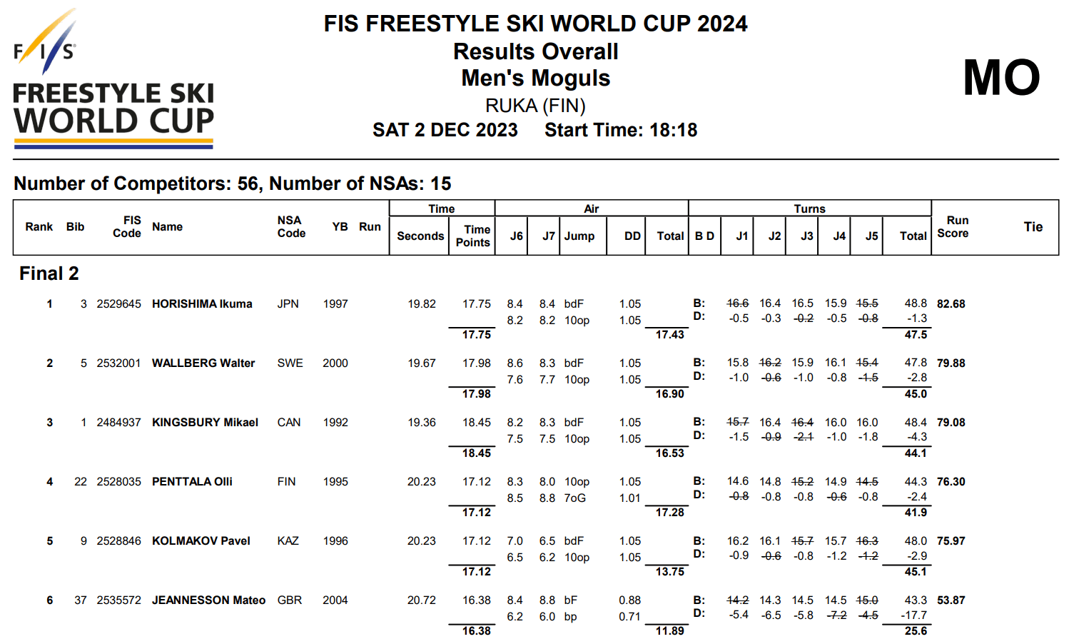
After each mogul race, the results are handed out in a PDF file that is particularly hard to read. Coaches and athletes then have to copy out all these numbers one by one into Excel spreadsheets, in order to analyze them, and figure out how to improve before the next race. This is a long, painful, and error-prone process. Here is an example of the PDF files:

After identifying this problem, we first set out to gather feedback from coaches who currently do all this hard work by hand. After teaming up with coaches from all over the world (Great Britain, France, Austria), we quickly found the following pain points:
- The manual extraction of the results is extremely slow
- The statistics are complicated to calculate
- The tabular data in Excel is not visual enough
- This process takes too much time, and the feedback is often delayed
The solution
Here is our answer to this complicated question.
Getting rid of manual extraction
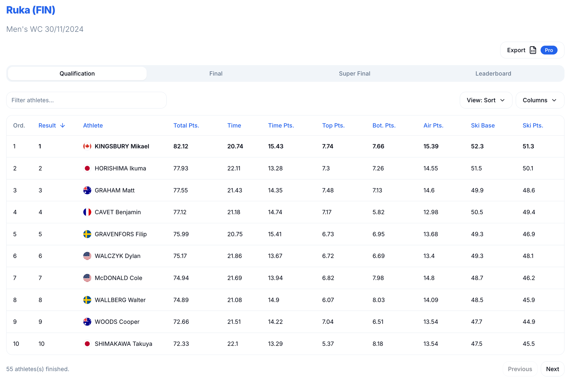
The results are now provided by us, instantly after each race. We then offer two options to our users:
- Export to Excel: with the click of a button, we transform the data into an Excel spreadsheet you can download and use as you want.
- The “Interactive Table View”: a way to view, sort and filter this table data however the user wants.

Calculating statistics
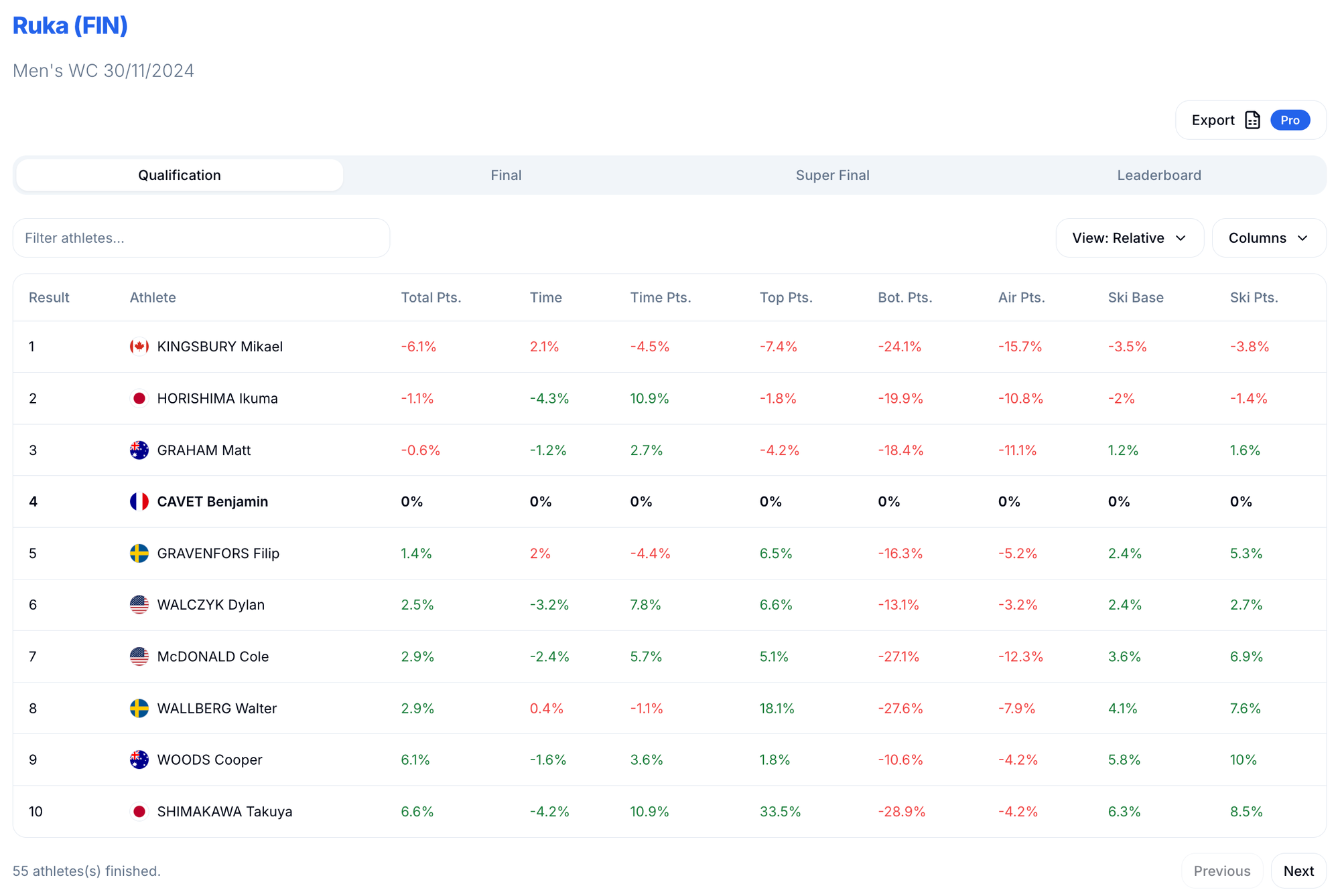
The idea here is to pre-calculate stats for coaches, so they can quickly get to advising their athletes. The best way we found to do so is to keep the same format coaches are used to, replacing the raw data with the stats. For example, coaches need to be able to compare the athletes results two by two. Here is our take on this, displaying the same results relative to one athlete:

Making data visual
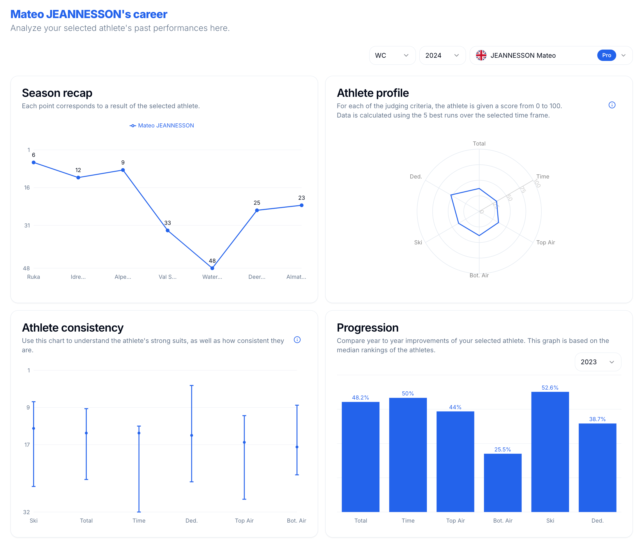
Even though these tools are powerful, interpreting the info can be complicated. That's why we also developed a visual interface to display data, and make it simpler to analyze.

Conclusion
As an ex-athlete, this is probably one of, if not the most interesting project I've ever worked on. Solving real world problems in a field I hold dear to my heart is so motivating, and seeing all the positive feedback we are getting is truly marvelous!
We hoped you enjoyed this introductory article, and will be posting a few more to show and explain the new features we implement all throughout this winter season!


